DataYard Website
INTRO
DataYard is an IT firm that approached me to update the feel of their website so they could emphasize their expertise in cloud services rather than local hosting services. The project was on a tight deadline, so the objective was to move as quickly as possible. In order to retain quality design and implementation, we decided to keep the scope simple.
PROJECT SERVICES & RESPONSIBILITIES
UX Strategy
UI Design
Development
Project Management
Client Provided: Final Assets, Copy
PROJECT OUTLINE
3 Design Rounds
Information Architecture
Style & Component Library
Final Page Designs
Build in Webflow:
QA Testing
Project Handoff
DataYard Website
DESIGN ROUND 1
My client wanted to explore a funky style utilizing some of their existing assets and their tagline, “Make IT better.” They described their ideal design as a mix between Bauhaus and Neo-brutalism. To determine how much Neo-brutalism to incorporate in the design, the first option favored this style.
DESIGN ROUND 2
Round 1 revealed that my client wanted to lean more elegant than playful. They also wanted to incorporate a “mountain motif” while staying away from “tacky business” imagery. The goal was to establish expertise with a professional tone without feeling stuffy. Based on round 1 feedback, I created 2 options:
DESIGN ROUND 3
The client decided they wanted to lean towards the first option of round 2, with a blend from round 1. This was the final approved homepage design:
Information Architecture
During an onsite with DataYard, we audited their current website and identified hidden, duplicate, and unwanted pages on their current site. We created a new document to be the source of truth and act as an outline for the new site.
Most importantly, I met the Assistant to the Regional Manager, Jerry (pictured).
Styles & Component Library
Since we had the homepage and the information architecture solved, I identified basic and intermediate components that would be helpful to re-use across the site. I added their colors, type, and other elements as foundational styles in Figma as a guide for their styles page in Webflow.
This project was purposefully not a full-fledged design system but a set of reusable styles and components that the DataYard team could use after the project handoff.
I did not use advanced features like properties, nor create a multi-layer token schema as it was important for each element to have high visibility and low-complexity. This kept maintenance time down since they did not have a member fully allotted towards the website. However, this solution still created a central source of controls for their site styles.
Final Page Designs
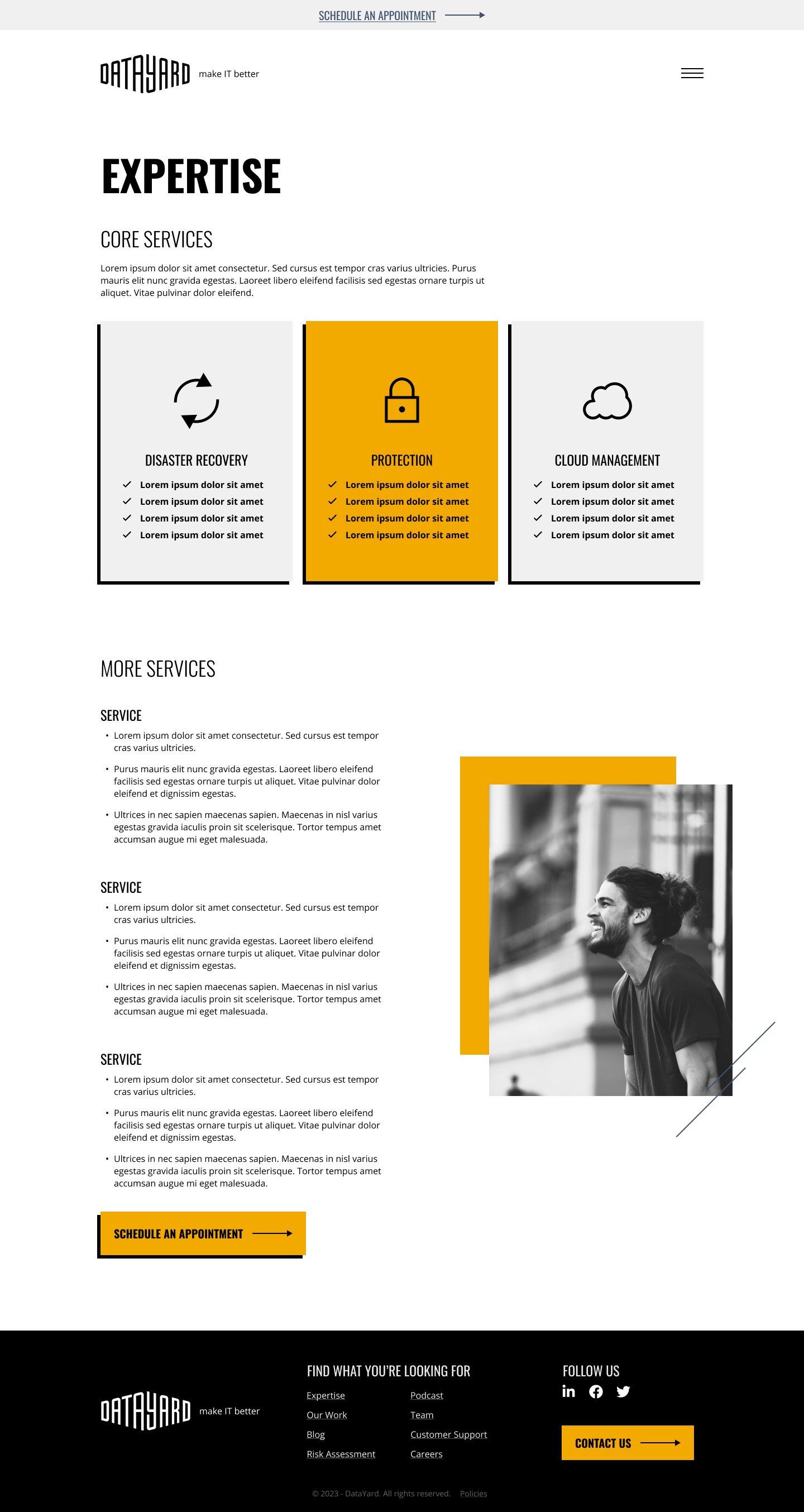
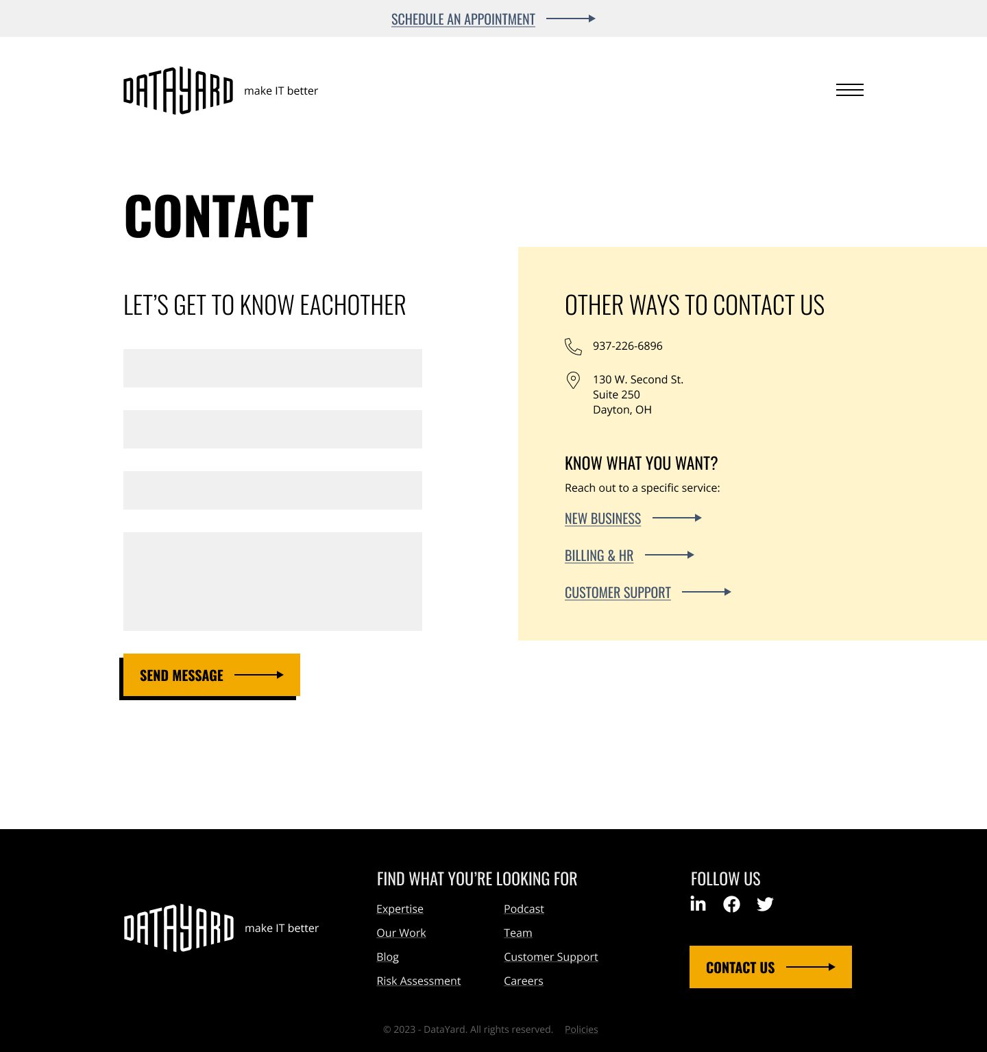
After creating the basic styles and components, I was able to additionally create several page templates. Along with reusable page templates, I designed the one-off pages. The pages and templates were as follows:
ONE-OFF PAGES
Home
404
Contact
Customer Support
Risk Assessment Survey
Podcast
Team
Expertise (main)
Case Studies (main)
Blog (main)
PAGE TEMPLATES
Expertises
Case Studies
Blog Posts
Policies


Build in Webflow
Once all of the designs were approved, I moved onto the build of the site. My client requested to move the site from WordPress to Webflow.
The build included the following:
Adding in the basic styles from Figma and their style guide as site styles
Styling default Webflow components
Building custom components based off of the approved designs
Building page templates utilizing the CMS feature in Webflow
Migrating their blog from WordPress to Webflow
This required a custom build using nested CMS’ in Webflow to mimic certain features like tags and categories
We removed older blog posts that the client felt no longer represented their work.
QA testing
Recorded training sessions with the Client Team
Official Project Handoff
When the deadline approached, my client desired more time to craft their copy and gather assets for the site. They felt comfortable with the handoff and their ability to launch the site once they are ready.

