Caroo - Design System, UX, & Marketing
INTRO
Caroo (Formerly known as SnackNation) is an HR SaaS platform that enables individuals, managers, and organizations to recognize their employees in ways that are meaningful to each teammate. Users can send physical and digital gifts on the platform as well as take a unique personality assessment that helps identify weaknesses and strengths across the team. Users can also add more details about how they like and don’t like to be recognized.
During my time at Caroo, I worked as their primary Product Designer. Our time was cut short once an external resource unexpectedly changed, severely impacting the company. I’m grateful and proud of our team for what we were able to achieve in 3 months.
RESPONSIBILITIES
Design System Lead
UI Design
UX Strategy
Ad Hoc Marketing Materials & Strategy
PROJECT OUTLINE
Design System - MUI x Cobalt
Marketing Materials
Membership UI (Coming soon…)
Design System - MUI X Cobalt
INTRO
Caroo was at the beginning of creating a design system. Since their were many live features on the platform, we were at a good stage to start standardizing and documenting what we had and decide how we wanted to continue moving forward.
Caroo heavily relied on MUI so that they could put more resources towards their custom components that were tied to their unique offerings and maintain quick turnaround times for features. This added a layer of complexity that was exciting: how do you build a design system that is dependent on another system, where different layers respect a variety of organization methods?
INITIAL LOOK AT OUR DESIGN SYSTEM
We had the incredible advantage of getting to decide how we wanted our design system to work from the very beginning. Myself and the engineering team regularly met to form a plan around how we wanted to build out our system, Cobalt.
We assessed what we already had and what was working/could be improved
We were ready to introduce a Monorepo structure to our project
We would re-introduce Storybook to engineering
How we organized Figma would be modeled completely after engineering’s repo structure and mimic their workflow
Design to engineering handoff would include fully functioning Figma components utilizing advanced features. This would allow us to agree and align on each components’ scope and capabilities as we built it
We planned to use ZeroHeight as our single source of truth for documentation while still adding more specific documentation in both Storybook and Figma
TOKENS
Since engineering was already heavily utilizing MUI, it made the most since to defer to MUI’s token structure and math. This would drastically improve our software maintenance; no more overrides.
To start, we only wanted to introduce the first two layers of the token structure and introduce the last layer, the components layer, later if we thought it would be valuable to our team.
Since MUI was using The Tokens Studio in Figma, it would be simple to give design access to the live tokens by creating a package in our Monorepo just for this purpose (note: this was right before the release of Figma Variables).
CUSTOM COMPONENTS
Aside from MUI, we had plenty of solutions that required us to build our own custom components. We would need to be able to consume both MUI’s foundational structure and components into our own reusable creations. Our components would need to be built with all of the correct properties that mimic the corresponding live React component.
I.e. If you log into app.caroo.com and take the RecognitionDNA personality assessment, your avatar on the site will change to reflect your unique results. The video shows how our corresponding Figma component could capture the correct behavior as the coded react component.
TIMING & IMPLEMENTATION
Changes like these take time. Stopping all feature releases to implement a design system isn’t reasonable. We also didn’t have a dedicated design system team that could spend 40 hours a week on it. We decided that a gradual implementation built into feature releases would be the most practical. We would take 1-2 weeks during our cool-down for the Monorepo and token initializations, and do the rest of the components as they came up in the features. Slowly but surely, we would replace our old components with our new standardized ones, and create entirely new solutions at the same time.
BUY-IN
Leadership was quick to give the green light to our proposal and we started making changes immediately. We would have loved to complete more of this work, but we were able to complete a staggering amount of progress in just 3 months..
Marketing Materials & Strategy
INTRO
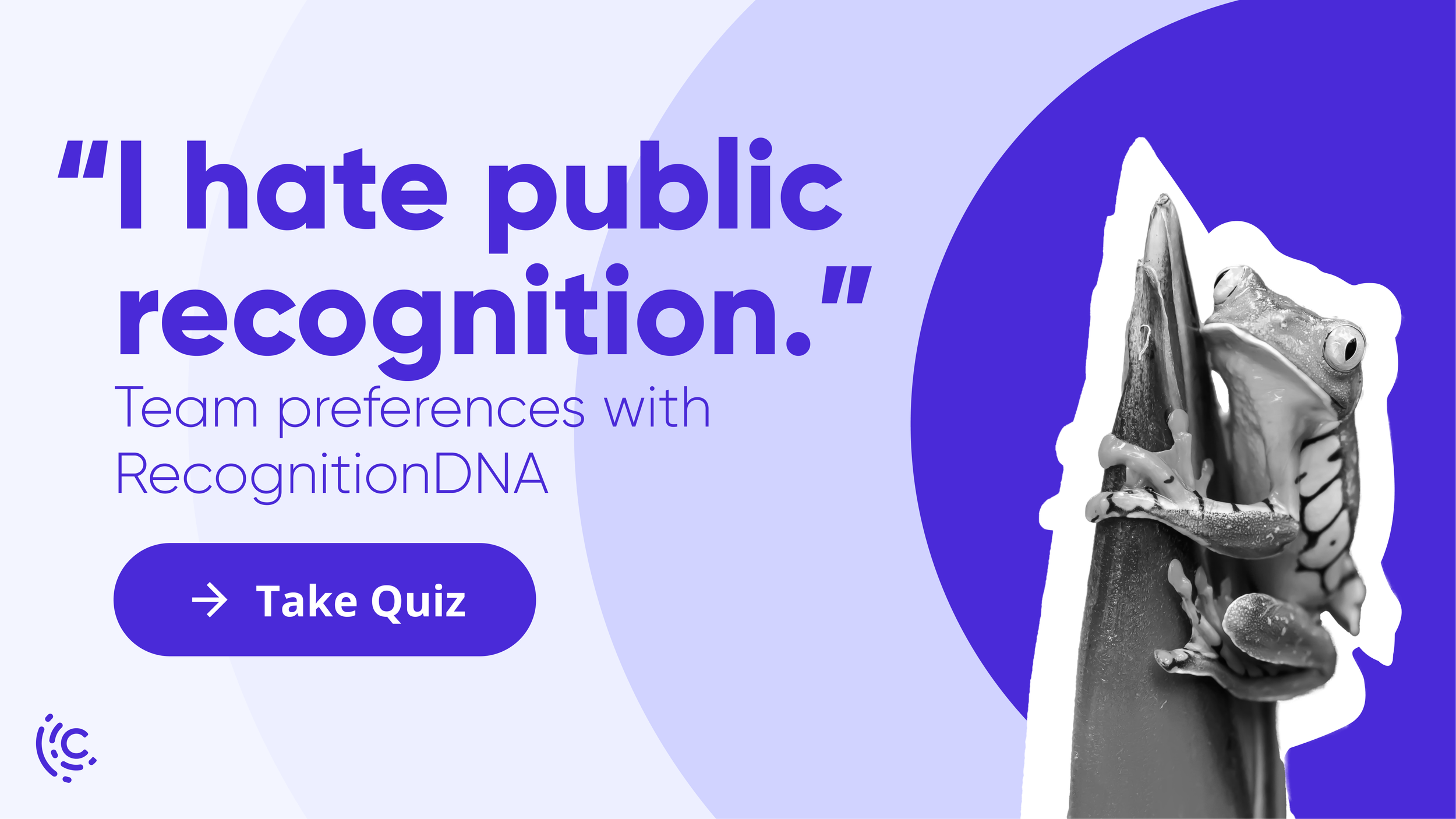
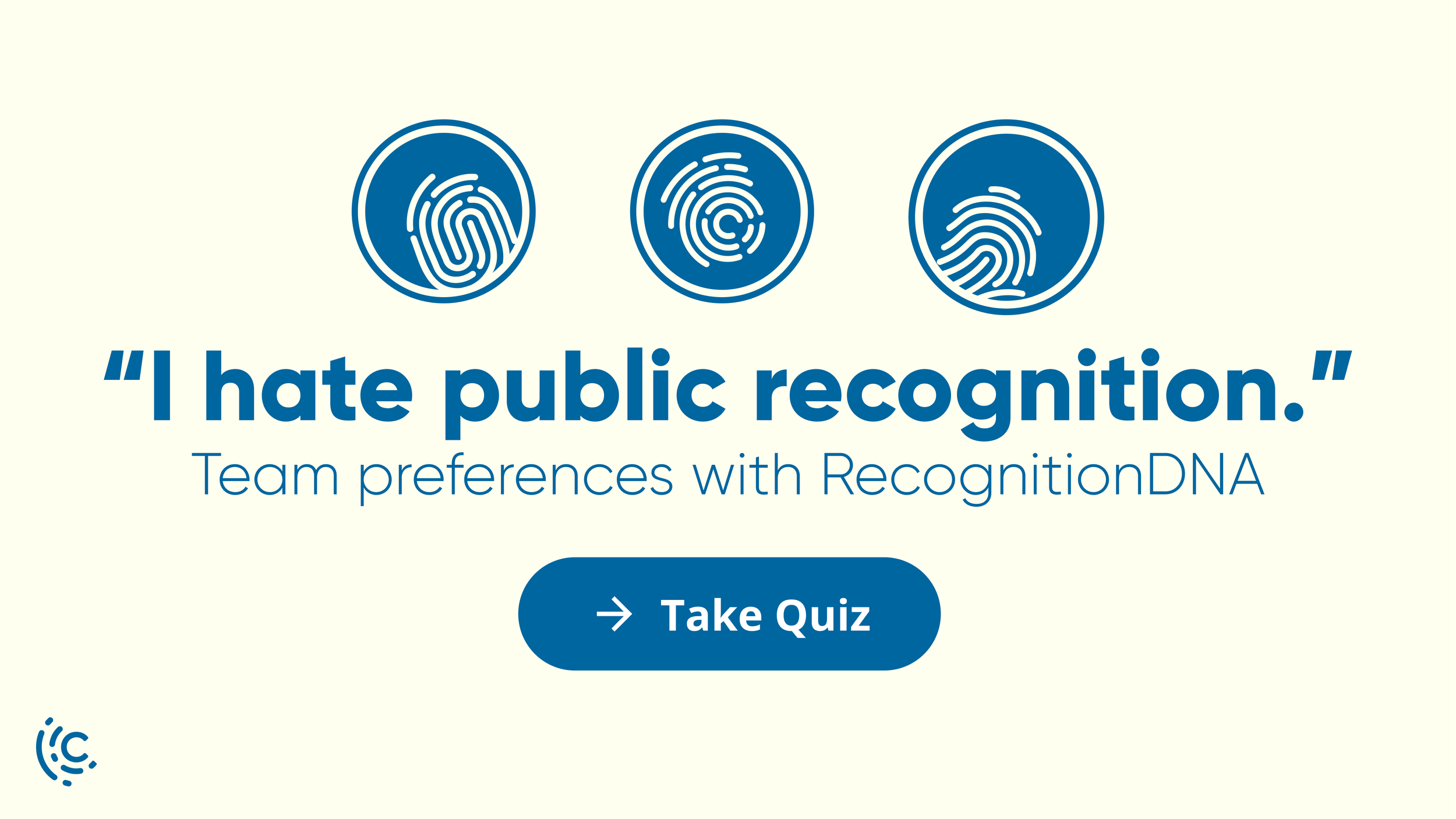
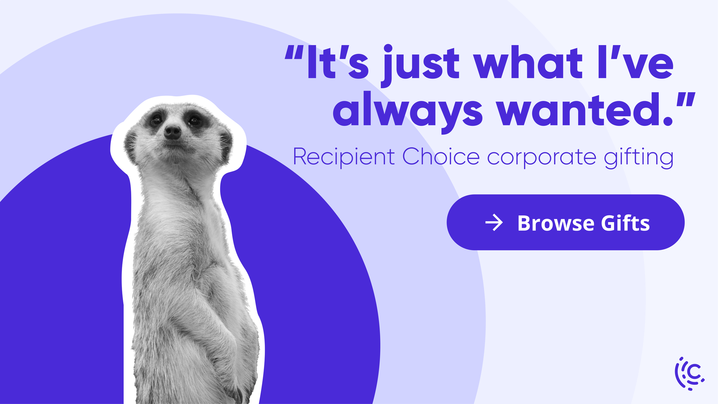
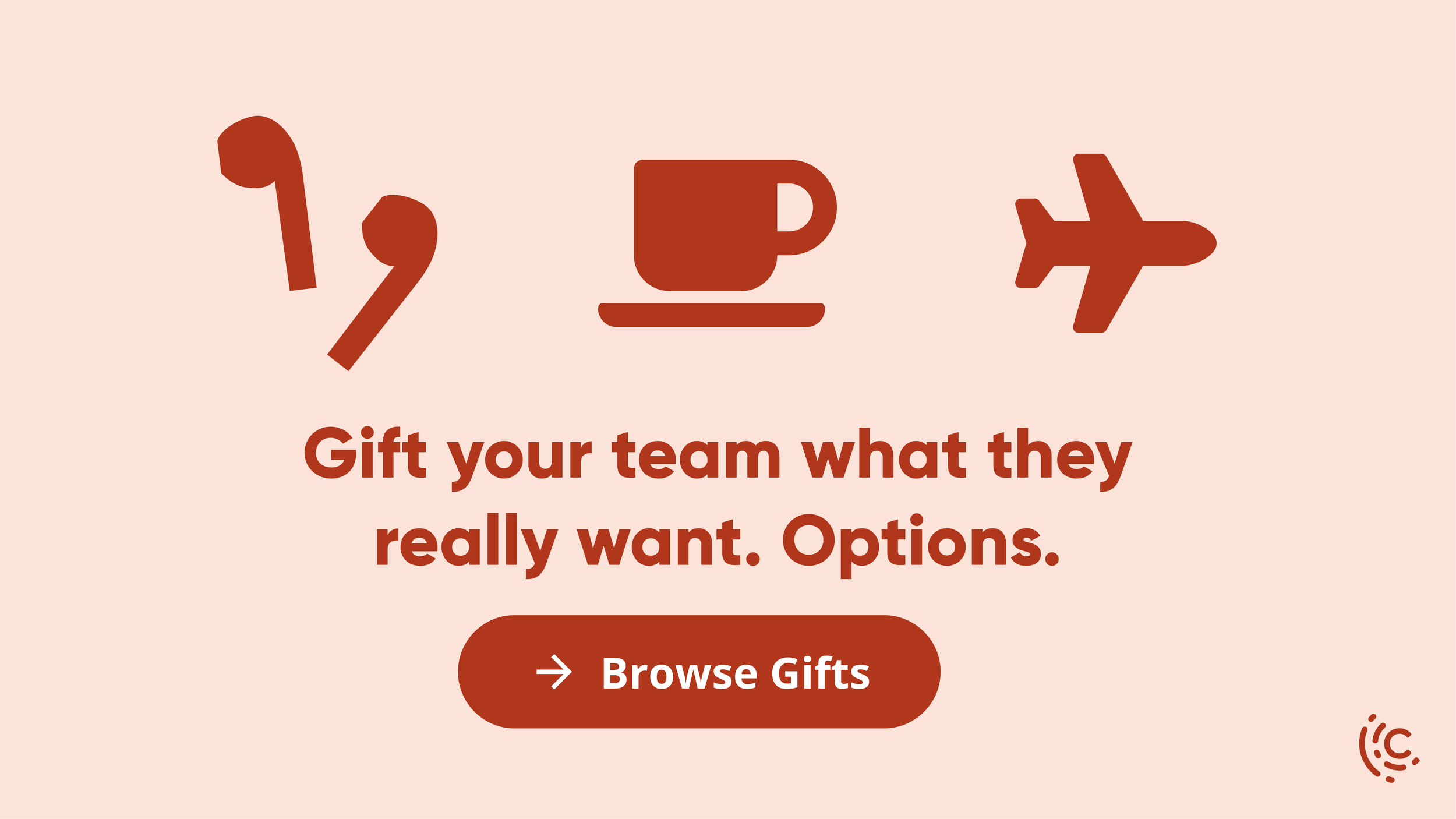
When I joined the team, Caroo had just finished a rebrand. The team relied on me to provide graphics for their ad campaigns and blog images exploring this new style. I also contributed to acquisition conversations surrounding our general voice and plans for the marketing website.
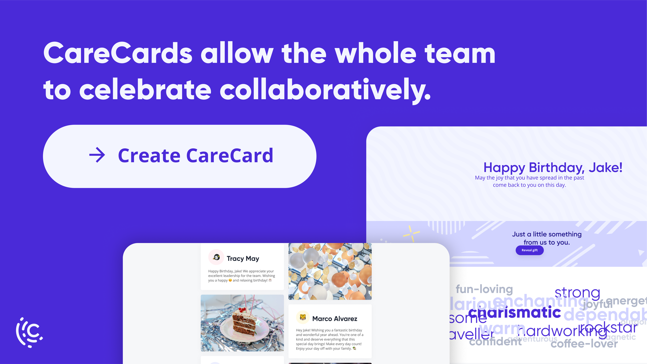
Here are some of the ads and imagery I created:





Membership UI
Coming soon 👀


