Design Tokens: An introduction to tokens and how they are used in design systems
About the Talk
During my time at Sparkbox, I helped lead parts of their UX/UI and Frontend Design Apprenticeships. We wanted to teach basic concepts about design systems early in the program. I was tasked with giving a talk on design tokens — a highly neutral topic 😉
Quick Resources
CodePen Example - This is referenced in the presentation, feel free to check it out.
Sparkbox’s Exploring the Anatomy of a Design System - Some of the slides reference materials in Sparkbox’s incredible list of resources on design systems. This talk was meant to help apprentices understand tokens in the context of this material.
What’s Covered
Where do design tokens fit in a design system?
What is a design token?
How do you manage design tokens?
Overview of design token layers
Example of design tokens in action (color walkthrough)
Recording
Slides & Notes

Design Tokens: An introduction to tokens and how they are used in design systems

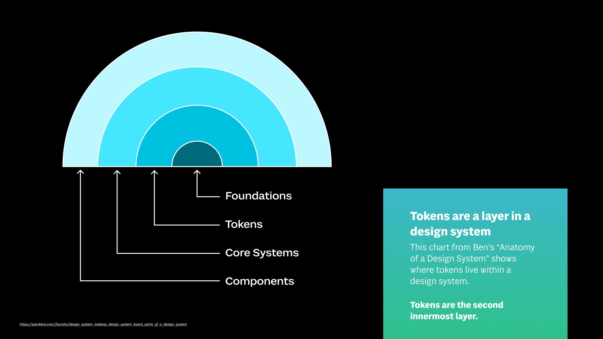
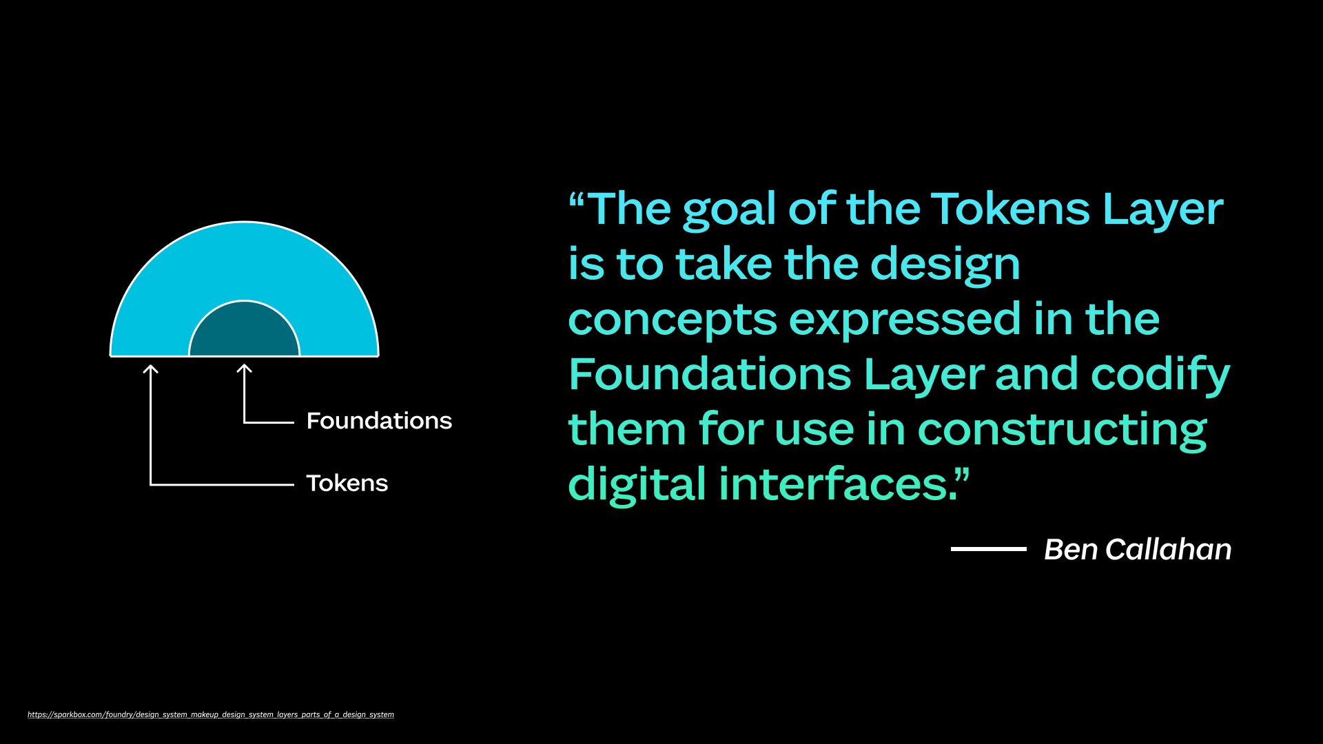
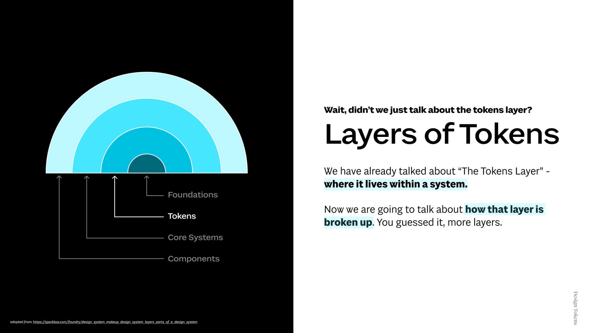
Before jumping right into what tokens are, it's helpful to know where they fit in a Design System.

What we can see from the chart, we know that tokens are a lower layer that becomes a building block for the rest of the system. It’s important to note here that when we use the terminology for design systems, the words mean different things in different areas of the industry. For example, in this case “Foundations” in a design system is referring to a whole layer of a design system rather than “Branding Foundations.” Ben will go more in-depth on these topics.


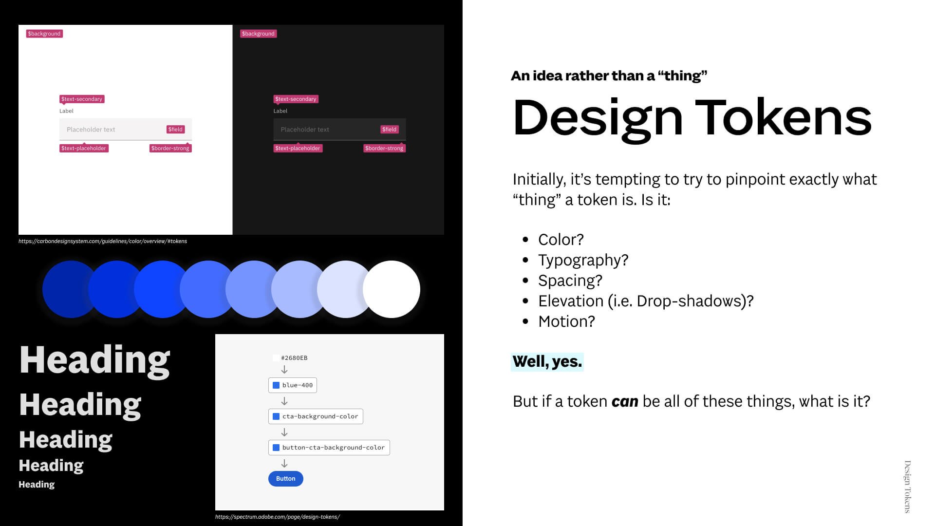
Don’t get caught up in the tool you are using. Tokens are independent from the many wonderful tools available to help create and manage them. Tokens exist in every space (Design and Dev).

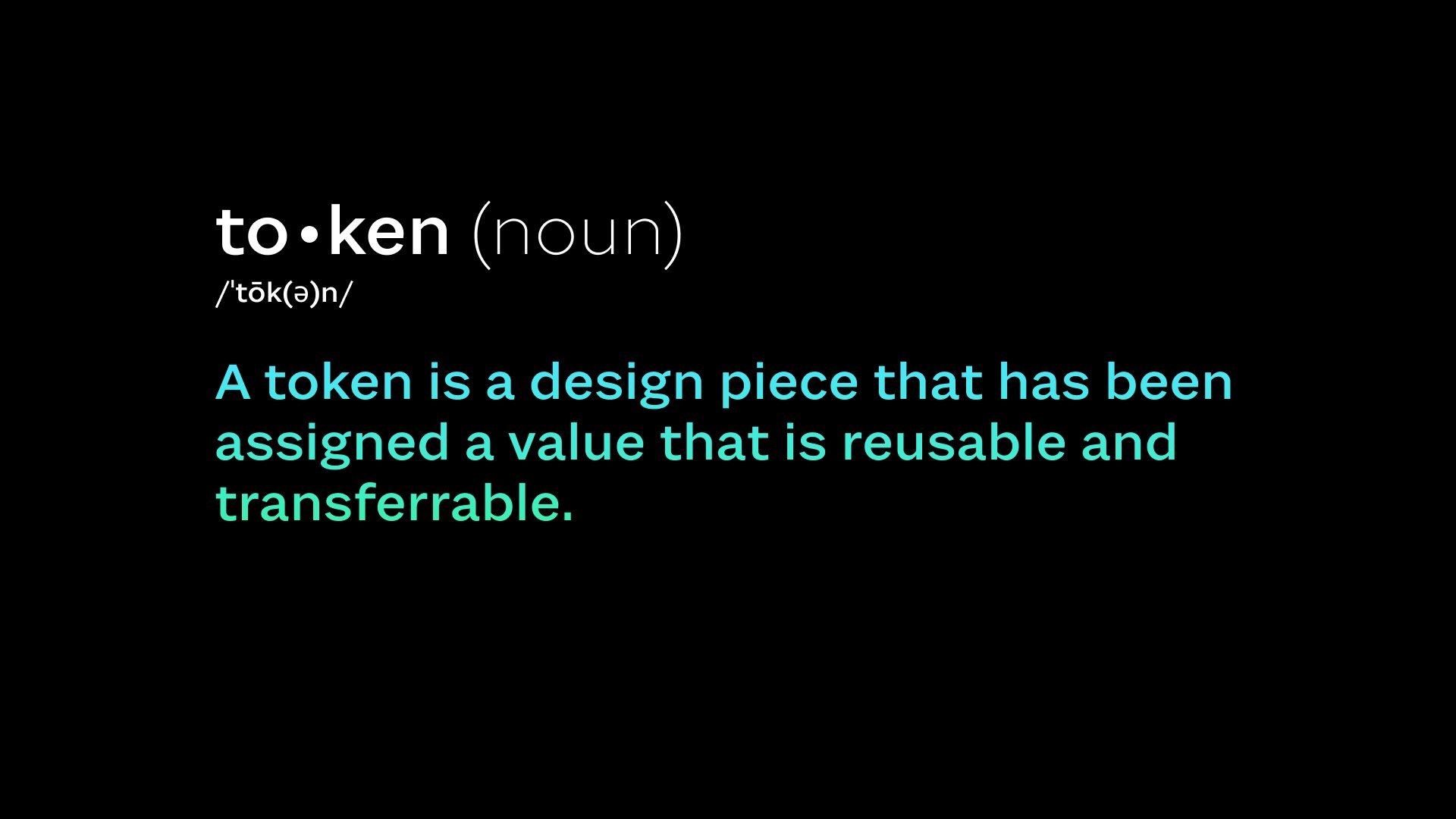
This is my attempt to define design tokens. I feel this at least captures their essence.

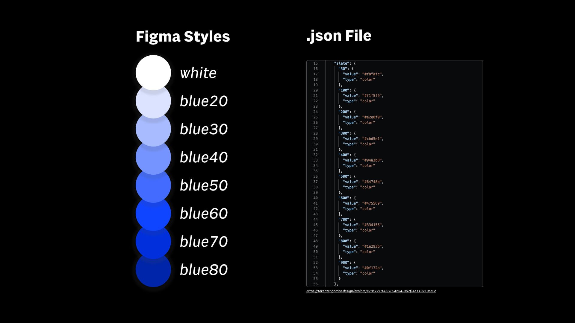
These both represent color tokens. One set of tokens is represented in Figma, while the other is represented in code. It would be tempting to say that “a token is a figma style” or “a token is a coded variable,” however, a token’s definition is much broader than this. (talk through each example) This is why we said not to focus on the tool you are using but rather the idea of a token. They live in both design and coded spaces and are used system wide. Just keep in mind that the coded version is the one that will be used in live production. These kinds of design values can be almost anything, remember? We could have the same styles/.json file full of spacing, fonts, font sizes, elevation, animation timing, and more.

Now that we’ve looked at an example, let’s review this definition. It’s reusable and transferrable! For example in the last slide, we could use any of those blues anywhere in the project and have it all be controlled in the styles. If we change the value of that style, the color will change everywhere in the project. Same thing in the code, if we change the value, everywhere we use “slate300” will change in the project!


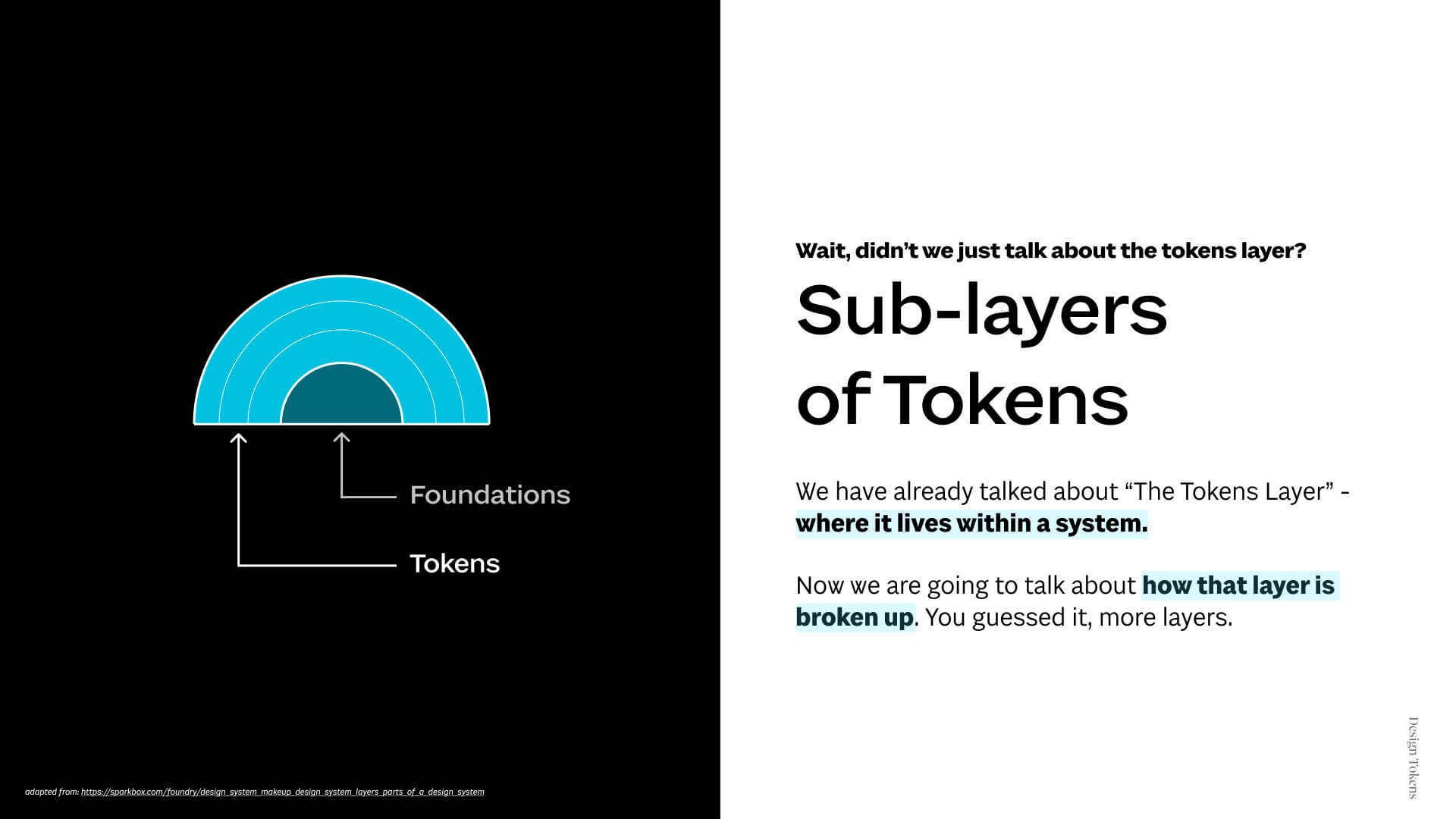
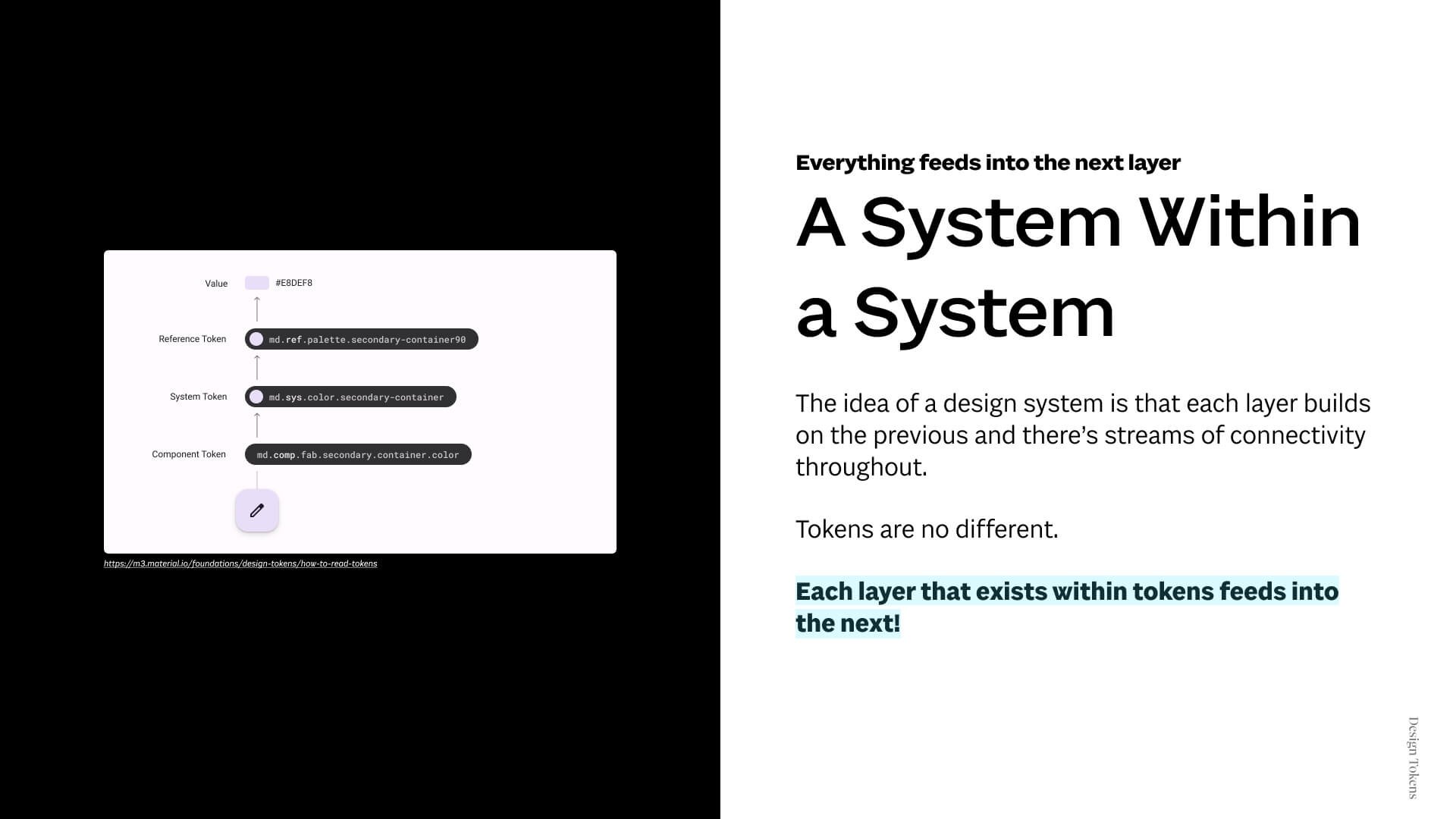
By definition, tokens feel very abstract and philosophical but in practice they are one of the most practical parts of a system. As we talk about how we manage tokens, we are effectively managing every other layer of our design system since each layer of a system builds on the other. If tokens are just values, you may be wondering why we’ve dedicated a whole layer to just these values with names. Admittedly, the rest of the layers seem very complex. Well, believe it or not, there’s even more layers within tokens than just the values. Many times, they are their own system within the system.

Most design systems will have about 1-3 sub-layers.

We aren’t going to go through all of the best practice, but know that you will see a lot of overlap and a lot of differences when looking at other Design Systems’ Token organization. The overlaps are likely the best practices and the differences is likely tailored to their team’s needs (Or they’re a hot mess, but aren't we all?)

Without getting too caught up in all of the naming, let’s look at an example of how this could work. We also aren’t going to get caught up in understanding code either for this example. We also aren’t going to talk through a specific tool at first - We simply want to understand the logic of tokens. Later you can explore how each tool can help! We are simply going to focus on the logic at play.

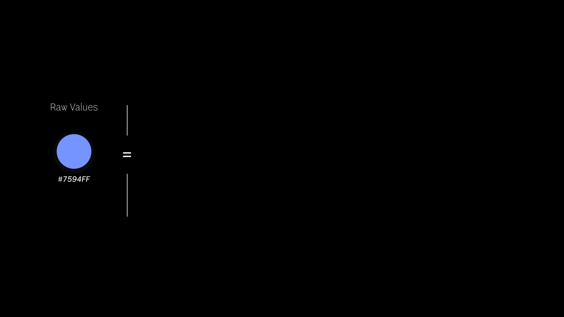
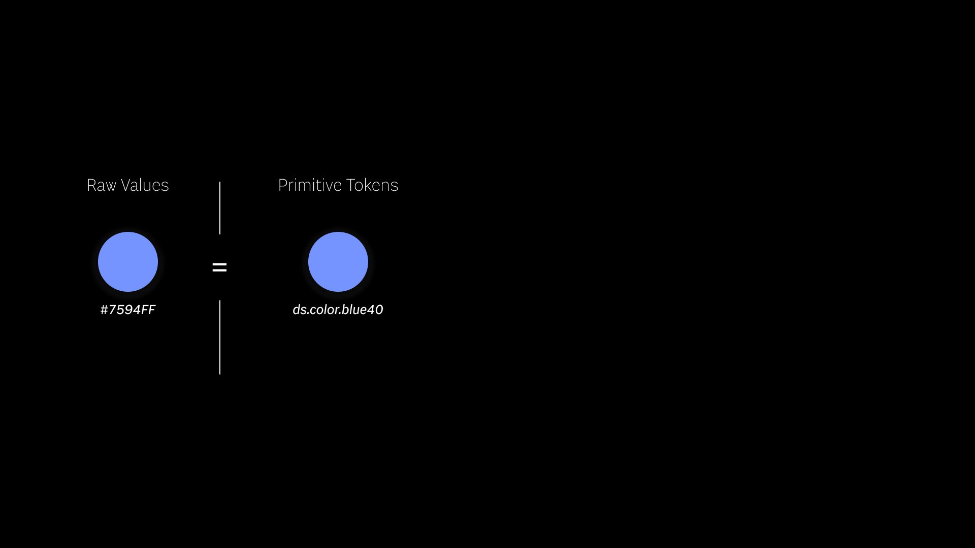
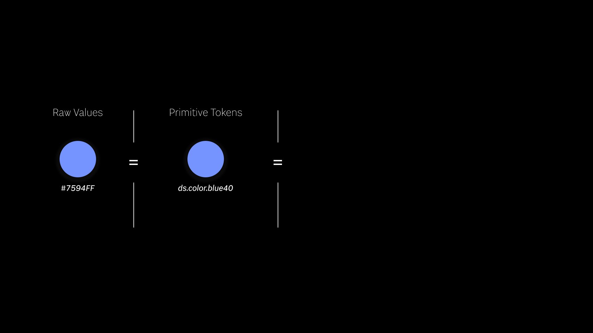
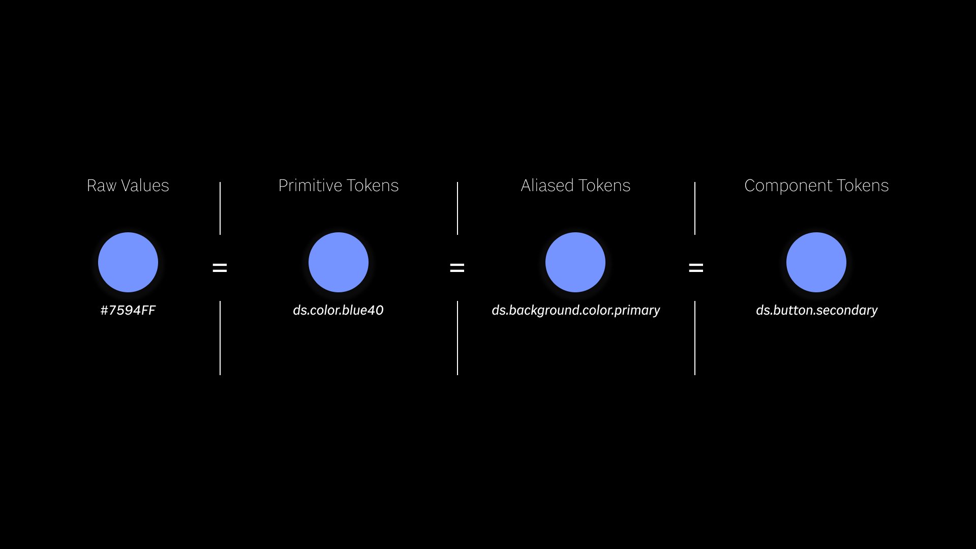
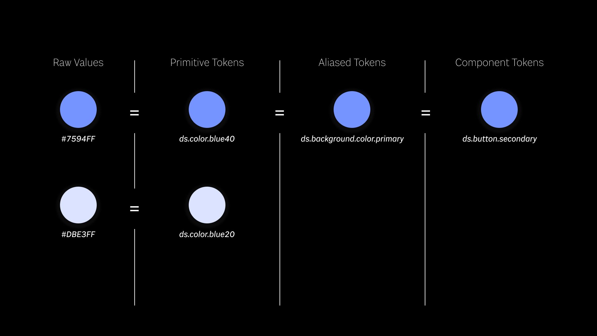
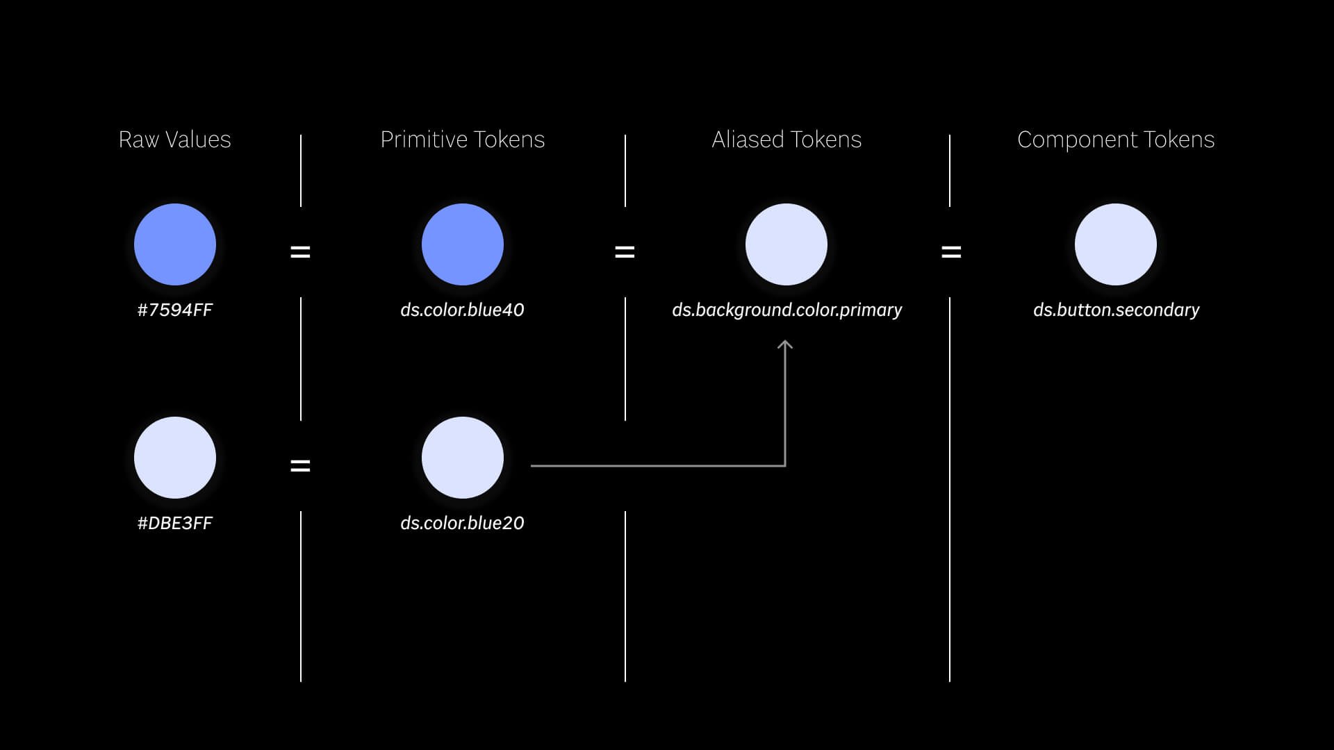
We are going to walk through a 3-layered token system. First, we start with a raw value that we know we want to add to a system. Now, we could just use a hex value for our whole system, but that means that we’d have to individually track down every time we use it in our system anytime we want to change it. So, it would be more helpful to give this value a name -- A name that can manage the value.


We then assign it a name. Boom, our first token. Again, we aren’t really going to discuss the ins and outs of token naming, but in this example, you could read this token as, “Design System, Color, Blue40”

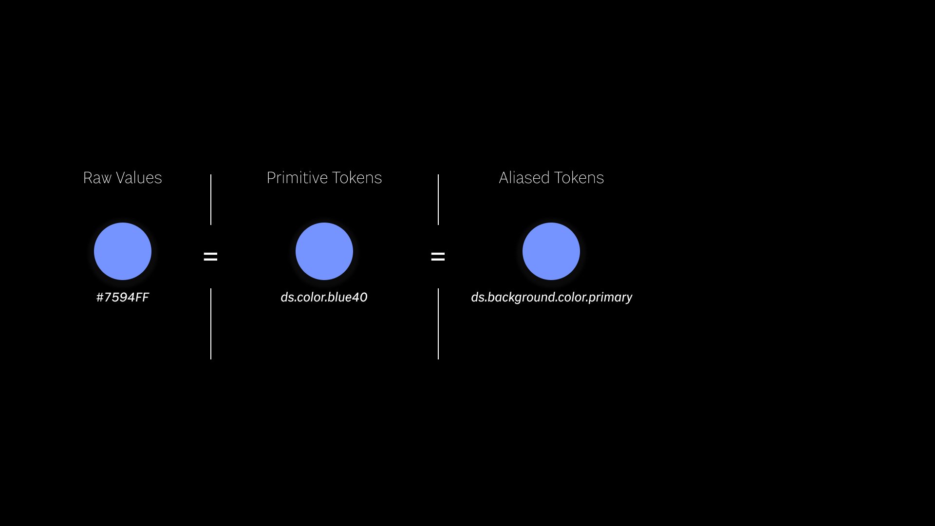
It may seem odd at first, but we are going to set this specific name equal to another name.

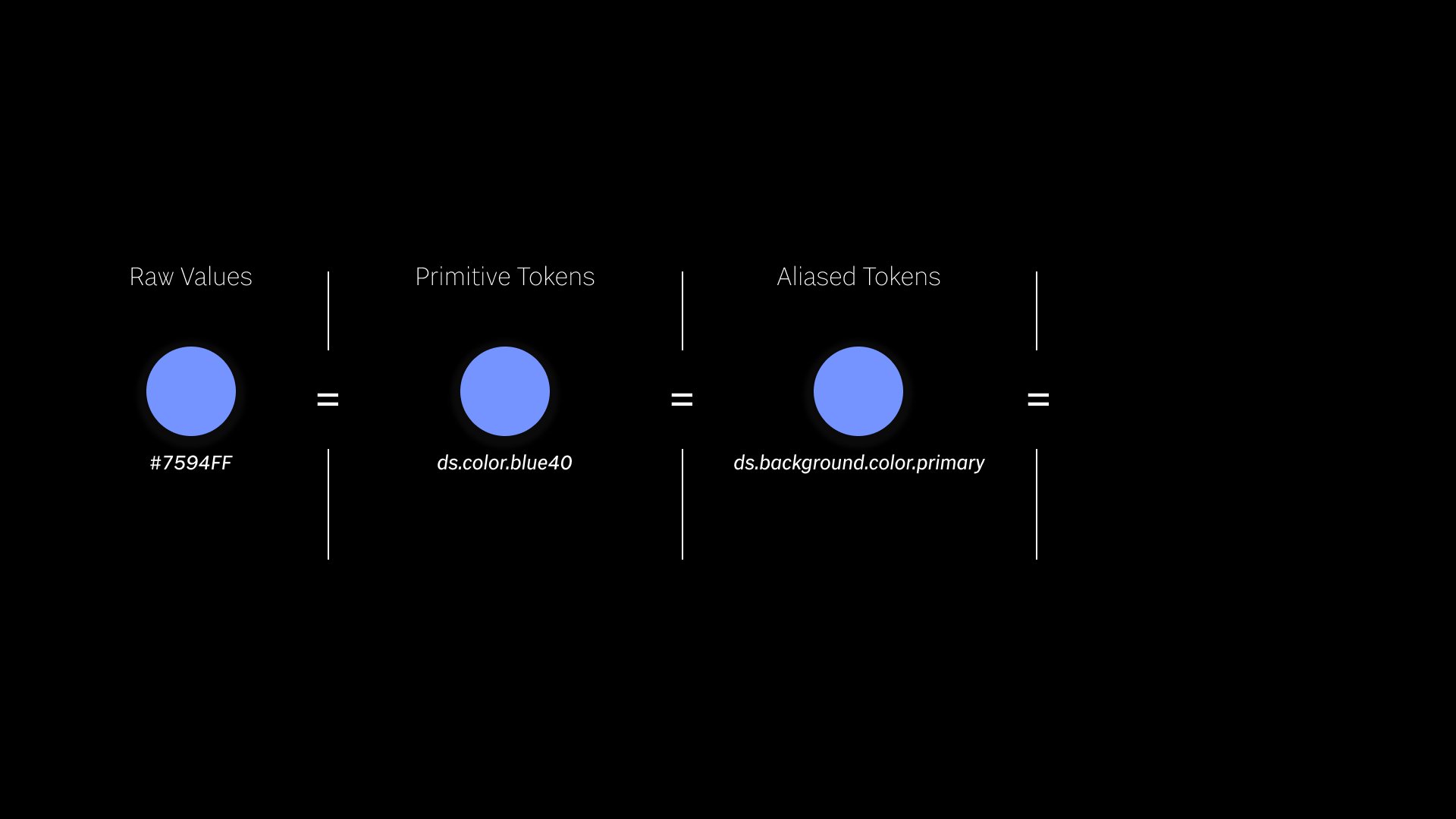
This name is going to be more specific than the last. This one could read, “Design System, Background, Color, Primary” -- Meaning, it is the primary background color across the system. Remember the Background color’s value, is blue40, NOT the hex value. We have a layer of separation between the raw value and the more specific token. A lot of design systems stop here. It’s already a lot of things to manage and getting a team to adopt. Remember, there’s lots more colors and many OTHER kinds of tokens that are also given names and put into these layers.

However, we’ll take a quick look at a third layer.

It’s common for the third layer in a design system to be specific to different components. Notice the trend of least specific to most specific throughout our layers. Here, we’ve set the primary background color to be the secondary button’s background color. Now we’ve gotten really abstract. Not only is our secondary button’s color not a hex value, it’s value also is not blue40. Rather the value is set to a background color. Okay so why would we do this to ourselves? This seems really nerdy and maybe slightly overkill for something as "simple" as color.

Well, let’s see what happens when we add another color. Here we have another value that we’ve named. Boom. Another token.

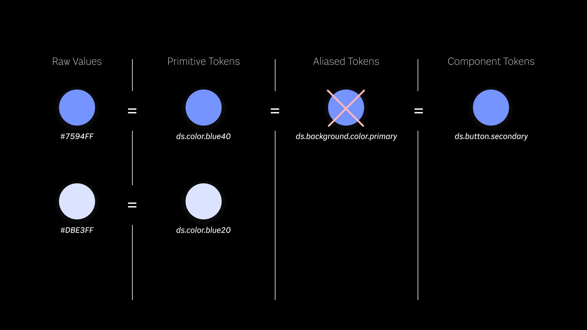
Well, let’s say that we no longer want our primary background to be so dark. We want a nice light color for our primary backgrounds. Luckily, we have another blue we can choose from.

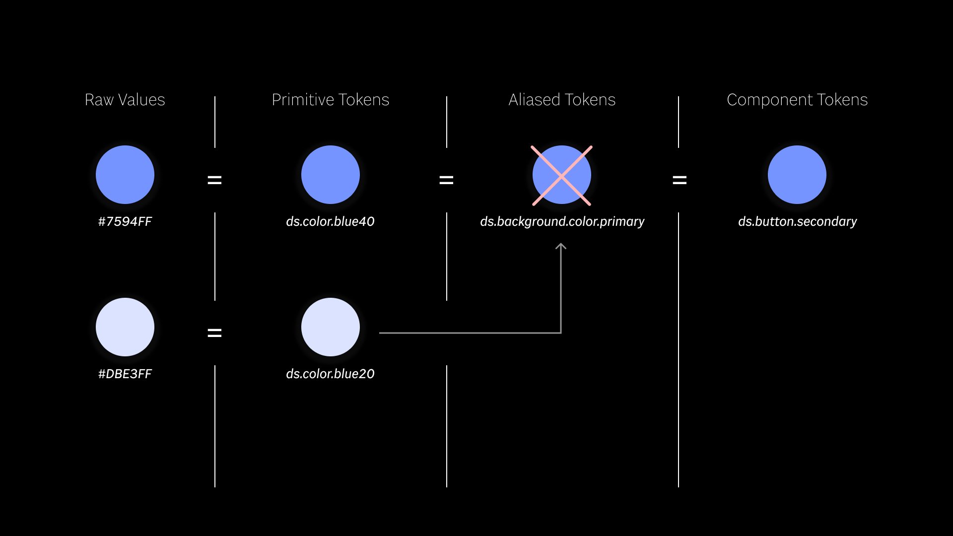
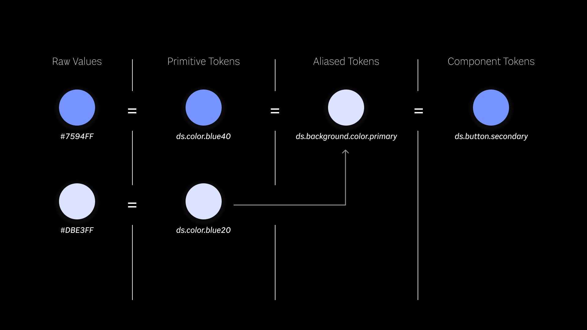
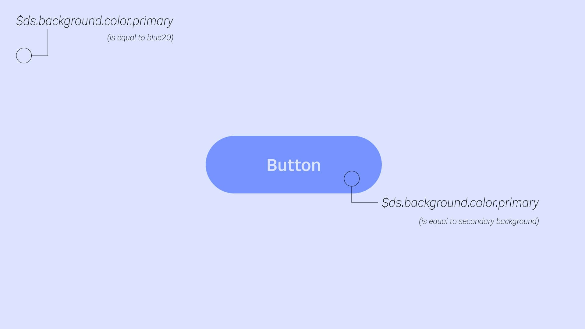
We simply say that ds.background.color.primary is now equal to ds.color.blue20.

All of the primary backgrounds across the site will instantly change.

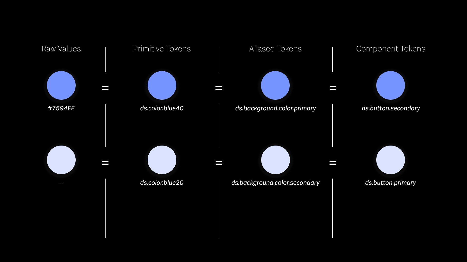
AND so will all of our secondary buttons! All the while a bunch of other tokens that had a value of ds.color.blue40 remain unchanged.


For the sake of this demonstration, let’s say that blue20 was set to our secondary background and that our secondary background color was set to our primary button.

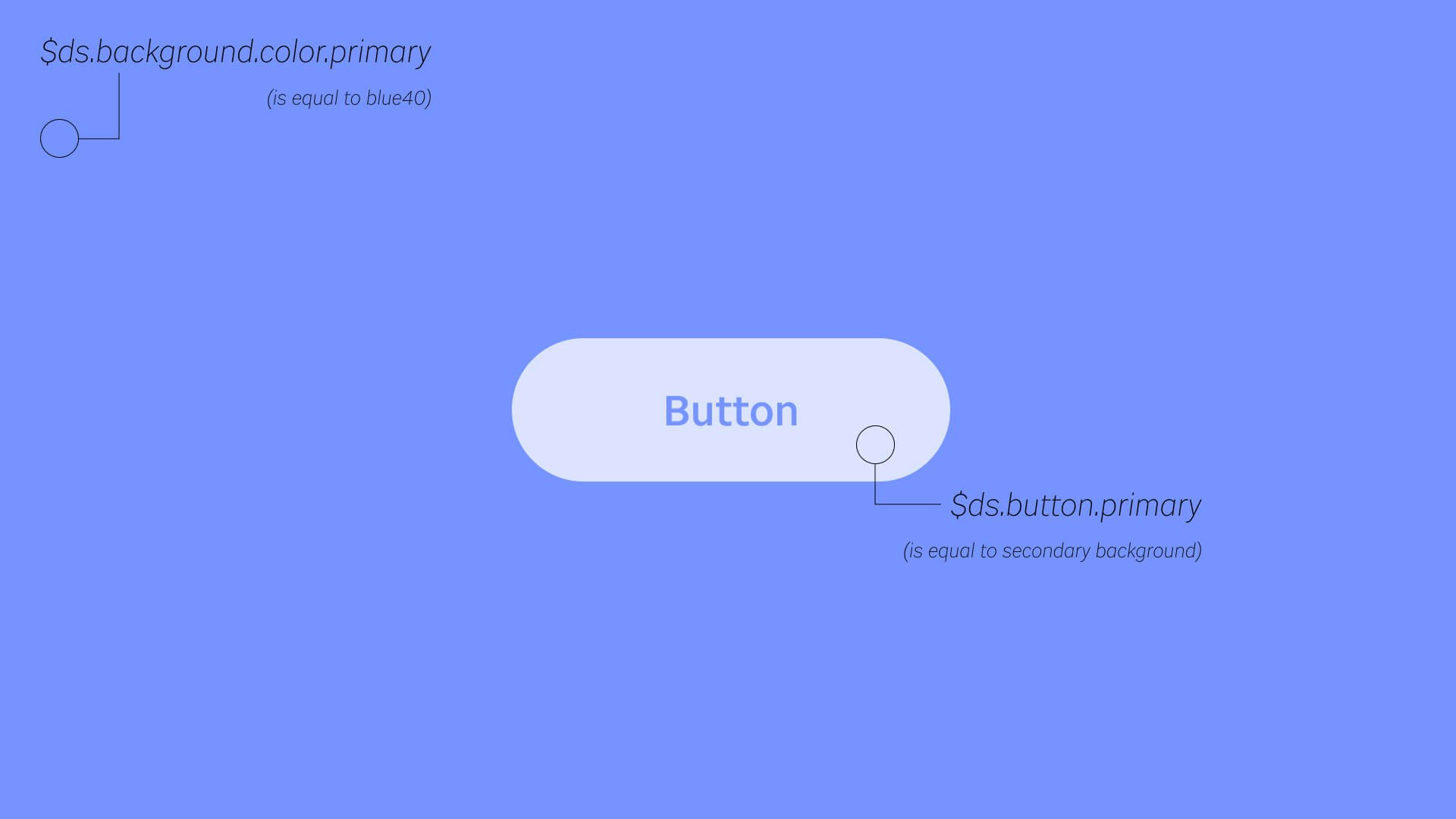
And this is what it would look like.

Say we swap like we showed in the other example. (not shown let’s say we do the same thing with blue40; we set it to the secondary background color)

This is what that would achieve. A complete inversion by one shift in our tokens layer. I don’t have to open up ANY other files other than my tokens files and the whole site is instantly changed. Furthermore, I didn’t have to manually change all of my buttons. Because they were set up they way we did, they are insured to have the correct contrast as long as our backgrounds are set up to contrast.

That example quickly got complex, and we don’t need to understand all of it. Whew. So what’s the main takeaway?

Tokens are a lot to set up and maintain. But that magical moment where everything changes without having hunt down every button, every form field, and every background on every page.... makes it totally worth it. Imagine a site/digital product with 300,000 pages (and trust me, they’re out there). Suddenly, maintaining one file instead of hunting down every instance of every individually declared color doesn’t seem so bad. The layers within tokens are there to help too! One inner tokens layer is great for a major brand shift, but at least two layers allows you more flexibility to not have to worry about breaking everything when you change a singular value.

If you feel confused, you are not alone. Tokens are one of the most hotly debated topics in the Design System community and commonly reported as the most confusing layer of a system. Some questions or passionate discussions you may run into are: Should there be 2 or 3 layers of tokens? Aren’t tokens just Sass variables? Do we really need tokens? How can I get my team to use my tokens correctly? Why can’t I just give my developer a hex value and let them figure it out? Why won’t my designer include tokens in my handoff file? You should always name your tokens like this and never like that. Can a token be more than one value at a time? You aren't alone if you are confused.


Keep this in mind as you come across these conversations and debates!
